Qué Quiero
Qué Quiero
Food Delivery App Redesign
Food Delivery App Redesign
Client
School project
Responsibilities
Lead Product Designer, Graphic Designer
Team Size
2
Timeline
3 weeks
Tools
Adobe XD, Miro, Adobe After Effects, Adobe Illustrator
Context
Product Design
Understanding The Problem
Qué Quiero is a food delivery application created in Las Palmas de Gran Canaria. In order to understand the users’ issues when they use the original application, we conducted a User Testing session in order to identify their pain points. We also created a Customer Journey Map that helped us better understand the users’ needs and problems through empathy.
‘It’s really confusing, I can’t figure out how to order food.’ - Rosa, 52 years old.
During the User Testing session of the original app we found the main pain points the average user encountered were:
Inability to find what they were looking for without getting frustrated.
Uncertainty on how much the costs would be until the final stage of the ordering process.
General confusion regarding information architecture.
These would be the areas in which we would pay the most attention to during the designing phase of the new app afterwards.

User Insights
We collected the functionalities of the architecture from the existing app, and carried out a closed Card Sorting, where users reordered the app.
We found that there is unanimity in certain categories, while others do not follow a common pattern. With this in mind, we restructured the information architecture of the new application.


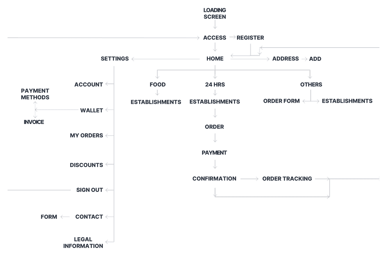
Wireframing
Wireframes are created taking into account the new information architecture, created with the intention to reduce the pain points found during the research phase to the maximum:
Minimised confusion when accessing the user’s account.
Signing in is mandatory now in order to access the application.
A simpler menu system is proposed for the user to understand it better, applying the results of the card sorting.
The fields to be filled in for registration are reduced, thus facilitating the process for users, increasing the potential rate of new registrations.

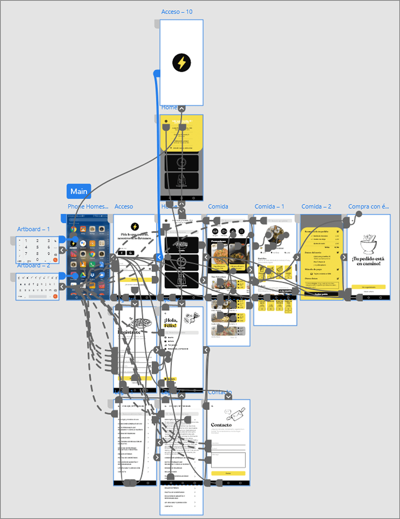
Interactive Prototype
We used microinteractions such as state changes and transition animations with the objective of creating an experience that was fun, natural and comfortable for the user, avoiding any interference with the main interface’s goal.
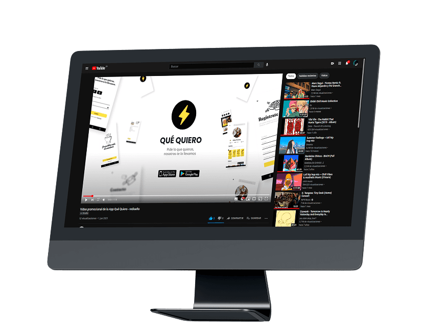
Besides the interactive prototype, we also created a promotional video for a hypothetical marketing campaign to make our application known.
We used microinteractions such as state changes and transition animations with the objective of creating an experience that was fun, natural and comfortable for the user, avoiding any interference with the main interface’s goal.
Besides the interactive prototype, we also created a promotional video for a hypothetical marketing campaign to make our application known.